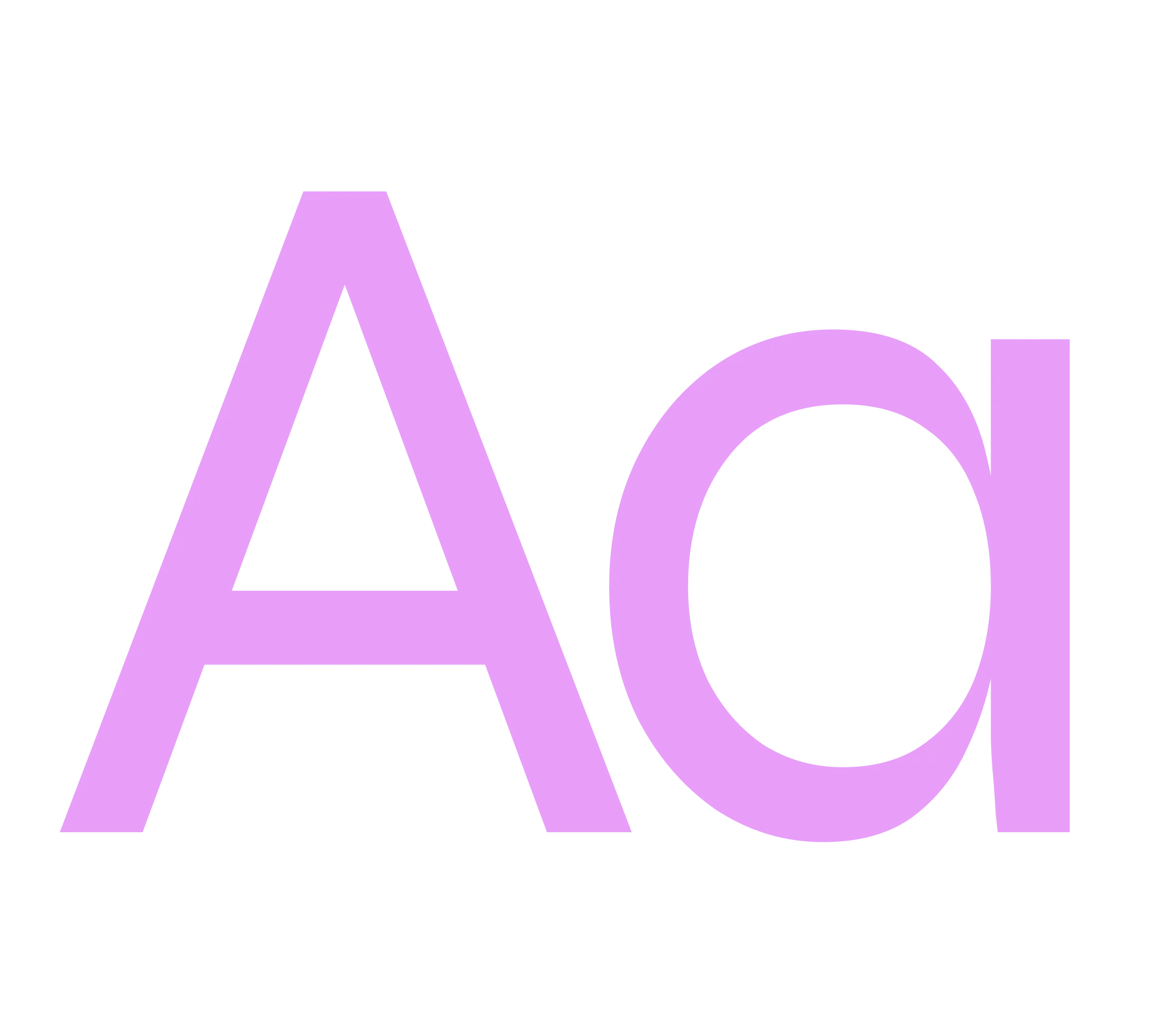
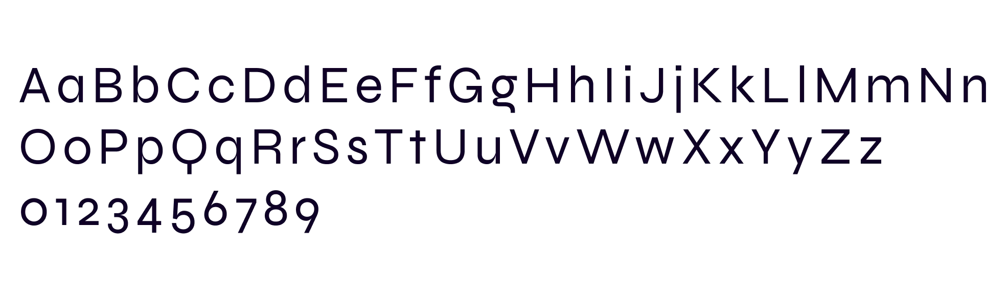
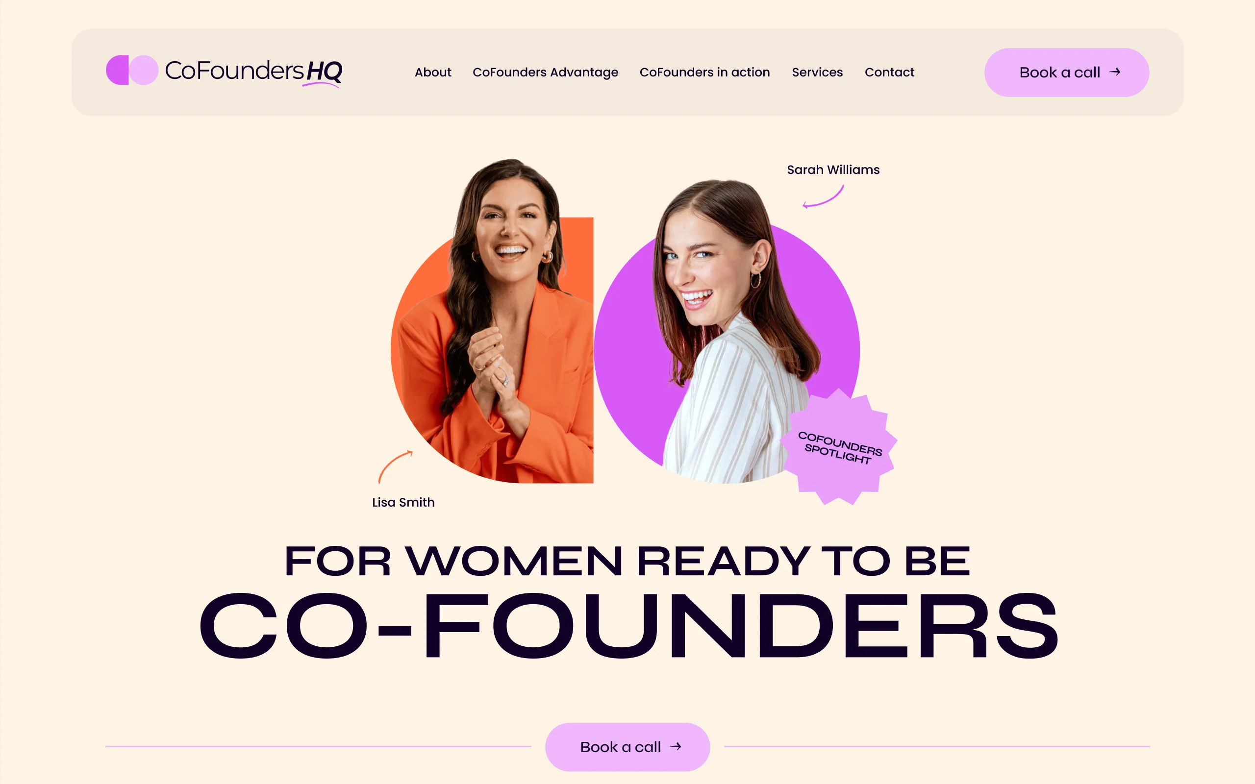
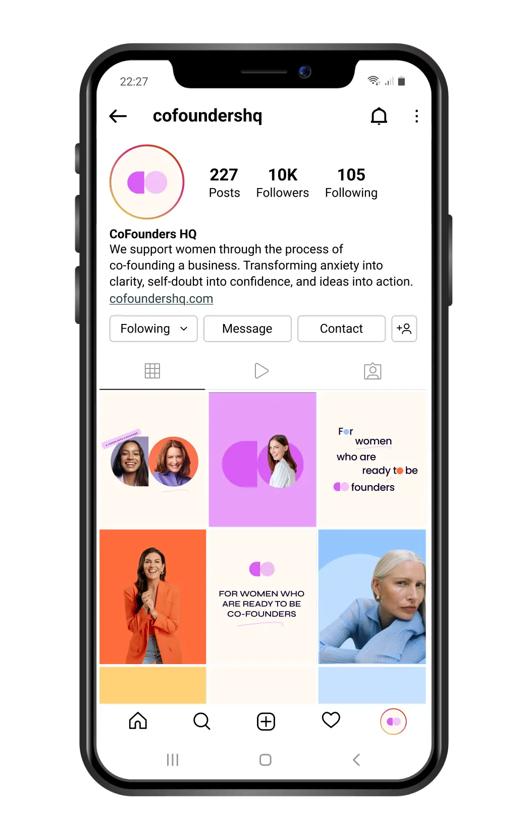
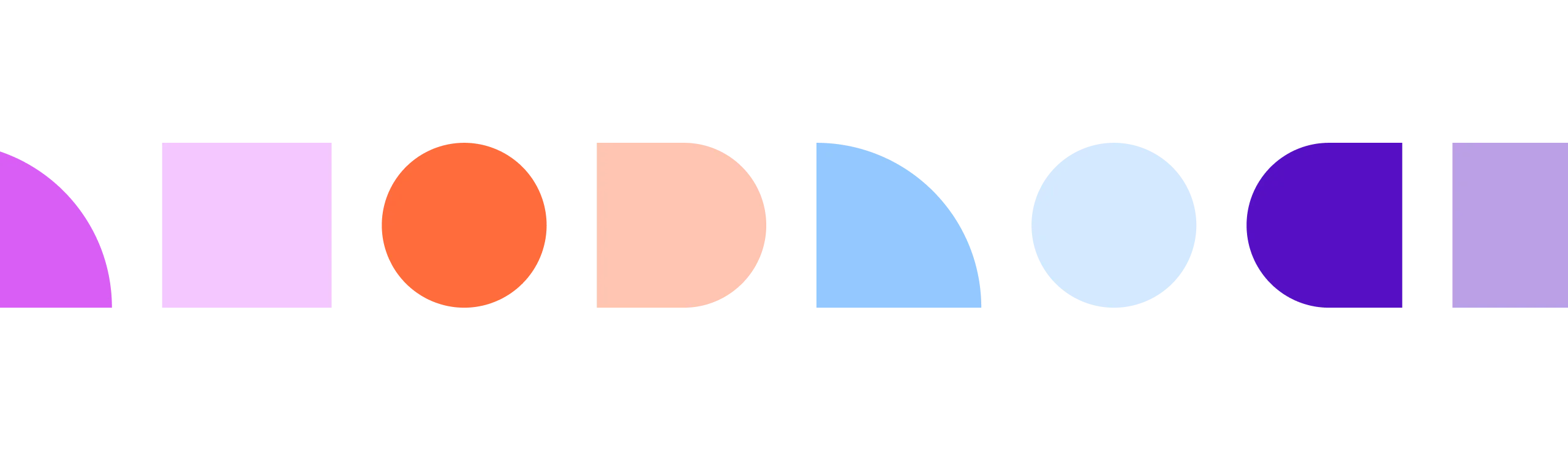
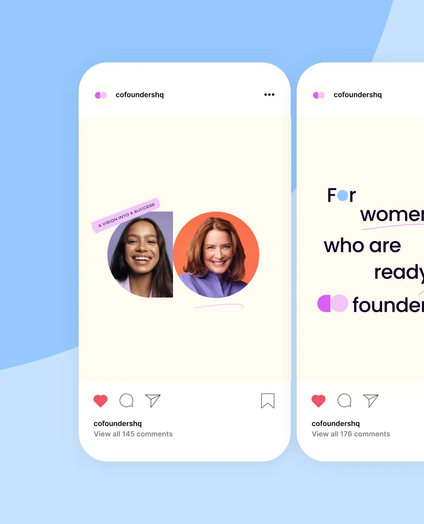
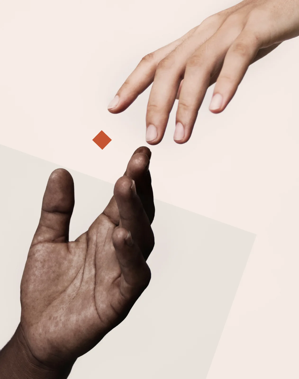
The strategy focused on "Shape Language"—using bold geometric forms to symbolize the momentum of partnership. Selecting a vibrant yet grounded palette to convey empowerment, paired with editorial-inspired typography to maintain professional authority. For the website design, I focused on an "expressive-detail" approach, ensuring the UI felt both high-fidelity and supportive of the personal stories within the community.